Refreshing the interface and redefining the traffic incident reporting app.
Road Event Reporter is an app made available for free to TomTom’s trusted partners who want to collaborate on improving traffic data. It allows to report incidents such as collisions, construction work or other traffic disruptions.
Used by several large well recognized corporations.
This tool played a significant role in 2021 during the floods following Hurricane Ida’s passage through the eastern United States and during wildfires in California and Australia.
Side panels
Locations – Table
My work – preview
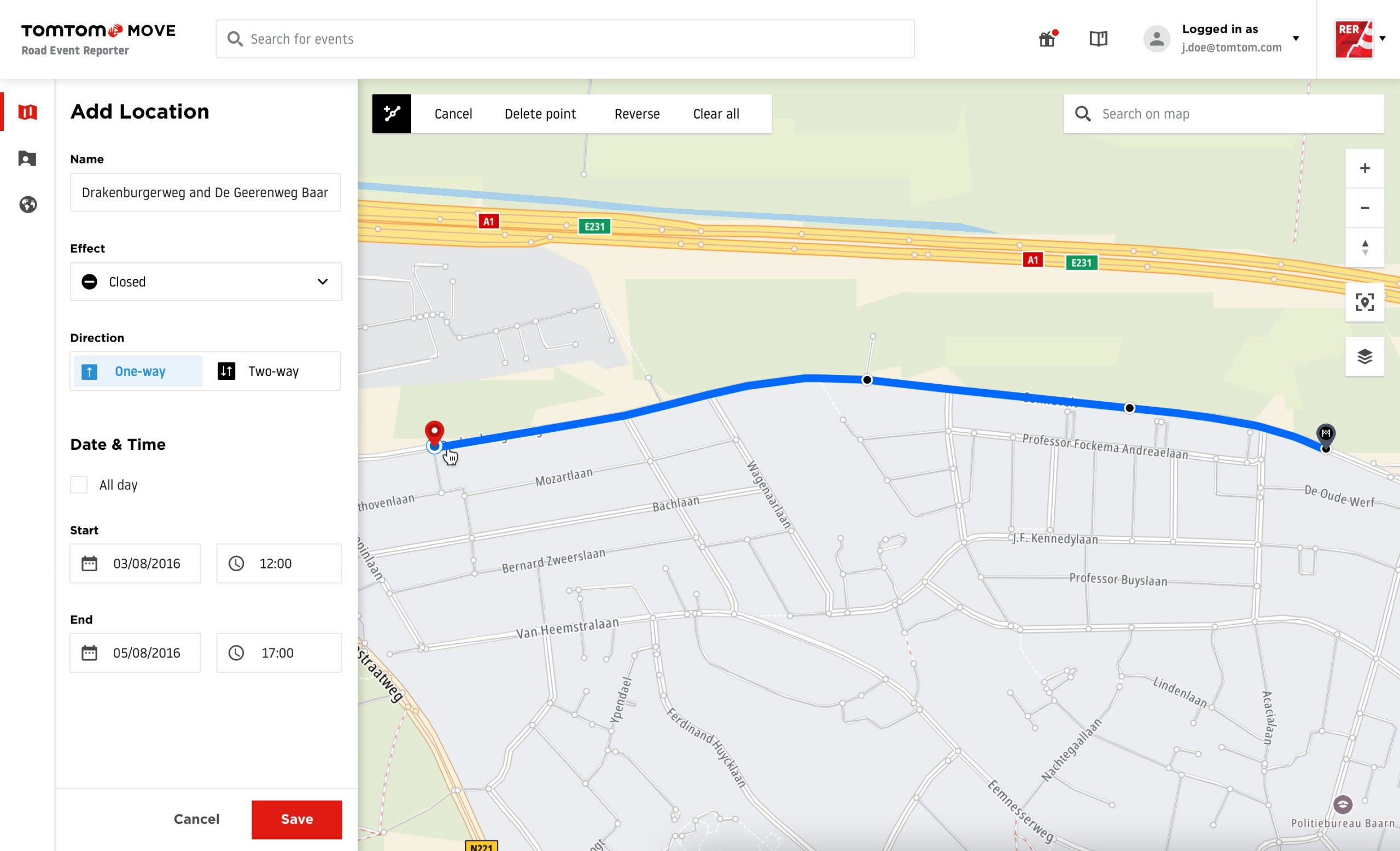
Add Location – Route
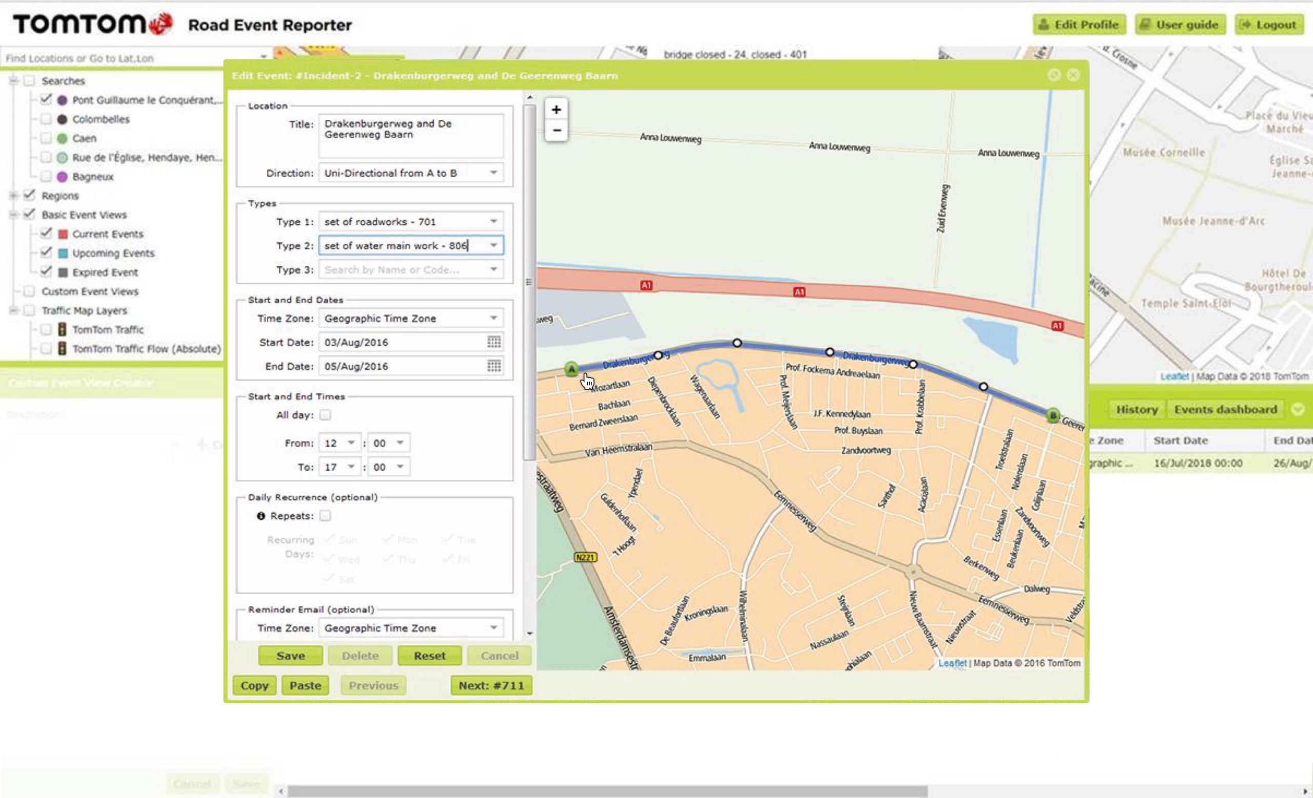
Edit Event – Tabs
Map – filters
Redesign comparison
View of adding an event to the system in the old version and after redesign.
UX process
Stage 1
Research
0
Interviews
Assumptions
Originally, the Road Event Reporter app was an internal tool for event reporting, thus improving the quality of our data. However, in 2018, there was a sudden need to improve the tool when it became available to our key partners.
Our assumptions were partially based on the feedback we received. There were several complaints: performance issues, outdated technology and poor overall user experience. The application had to be completely rewritten, which created an opportunity to approach the process the right way.
Initial interviews
There was no problem with choosing the right candidates – our users were moderators employed by the companies we cooperate with.
As their work is a team effort, we decided to organize focus group interviews with about 5-6 participants each. Such meetings were held on-site at both clients, and I attended them. With the third client we had a remote interview.
Discovery & Analysis
After the elaboration of notes, several UX artifacts were produced. These included personas and user stories. With the help of the product owner we gathered also the use cases and business requirements.
Later I conducted desk research and competitive analysis (One.network was the product most similar to ours).
Problem clarification
We could already tell what the users’ biggest problem is, besides a slow, outdated system.
The work was cumbersome because the submissions were reported using the TMC code list, which had more than 2000 positions! This needed to be simplified, so we decided to limit the list to the most needed events and apply mapping to keep them compatible with the backend.
Users lacked a dashboard and a list of recent closures to manage their events. It was difficult to collaborate and delegate work to others, it was necessary to use additional documentation outside of the application.
Another problem was the limited ability toplan recurring and overnight events.
What we found out, among other things, is that there are moderators who go to the event site to live update the traffic in line with police recommendations. Therefore, it was equally important to adjust the solution for tablets and mobiles.
There was plenty to work on!
Stage 2
Design
0
Usability testing
sessions
0
Shadowing
sessions
Flows & Wireframes
We decided to go with the concept that showed the most promise. We didn’t limit ourselves in creative work and even proposed an advanced scheduling solution with a calendar.
We’ve made some big changes, including a new approach to event structure (now one submission could consist not of one incident, but many, which greatly improved the flow).
After the interviews, we also knew, among other things, that additional event filtering capabilities were needed, so this was also taken into account.
Interactive prototypes
Of course, right after wireframes first interactive prototypes were created to showcase the idea internally and of course one fine-tuned for specific usability testing tasks.
Usability testing – prototype
As we established a good contact with our partners we could invite them for usability testing.
First we held sessions with the people we already talked to – it was 8 in total.
The main goal was to check if the new flow is understandable. Is the new event structure appropriate and what are the general feelings about the interface.
We learned…
Then it was time to test it once again. After a few weeks we did internal usability testing on new, adjusted prototypes with 3 selected users.
We learned…
Interface design
As we had some deadlines, we had to get to work quickly. The application was created gradually and had been constantly consulted with the developers and product owner.
There was a lot of work with interactions on the map and some limitations that we had to overcome to deliver the product on time.
However, after few months we managed to create a beta product that could be used by new customers.
Usability testing – application
In the meantime, the decision was made to significantly expand TomTom’s moderation team. This time we wanted to check the app also with them. We arranged 4 usability testing sessions.
We also conducted 2 additional sessions with colleagues not related with the tool at all to check how newcomers would perceive the tool.
We learned…
Future
After more than a year, the application was in a good shape, but we had to decide what the next steps would be. We chose to do shadowing with short interviews afterwards to better understand the processes and current usage. It was done with internally with 5 moderators.
We learned a lot about teamwork and organizational needs – the result, among other things, was a dashboard with statistics and a list of own events to help manage the work.
Stage 3
Maintenance
Product development on hold
After a time of prosperity and high demand for the tool, its priority dropped tremendously and was turned fully into maintenance mode.
Occasionally I was asked to solve some urgent fixes. I also dealt with incoming feedback in my spare time.